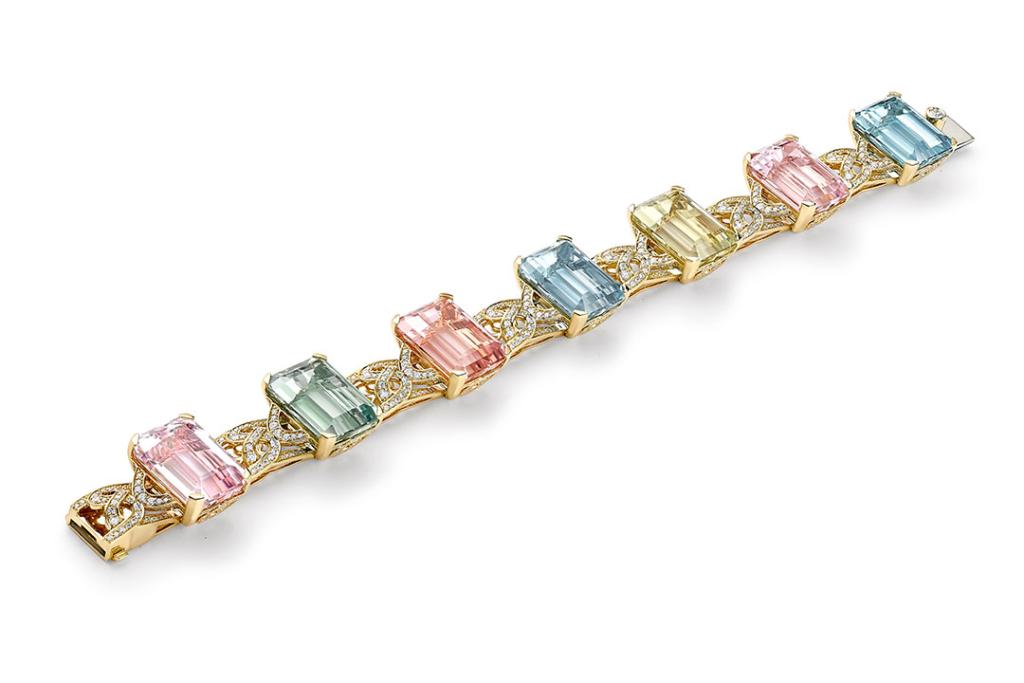
Designing the Lady Lever bracelet
With a combined 300 years of creative history to draw on, a collaboration between Boodles and the Lady Lever Art Gallery was always going to be special. Rebecca Hawkins describes how she was inspired to design the Lady Lever bracelet.

The design process started with a visit to the Lady Lever Art Gallery, initially to reacquaint myself with the building and the collection it houses but also to get a general feel of the ambiance.
I then followed this up with another visit to look a little deeper. I took numerous photographs of the inside and outside of the art gallery, the surrounding buildings and the collection of art, furniture and objet d’art held within the gallery rooms.

These photographs were collated into a series of mood boards, grouping the images by colour, architectural features, design styles from different eras and images of Lady Lever herself.
Essentially, the process of creating mood boards is a way of organising your thoughts in a visual form. It helps you to identify common threads that can be woven together to create a narrative that is more rounded. That gives a sense of the subject matter in its entirety.

Focusing in on one single feature has the potential to be too generic and it's important that the bracelet design specifically represented the Lady Lever Art Gallery as opposed to any gallery or building of the same era. Layering ideas creates more depth and individuality to link the final design more strongly with the theme and inspiration.
The choice of stones was inspired by the Pre-Raphaelite and Victorian paintings in the central hall of the gallery.

The Pre-Raphaelite movement had a very distinctive colour palette. The artists painted with pure colours over a brilliant white background, rather than priming their canvases with a wash, which resulted in incredibly vivid colours that are - quite fittingly - often described as jewel-like! Their desire for intense colours led them to grind certain pigments themselves, rather than buying the oil paints ready mixed, in order to achieve the best results. This luminosity of colour is a key characteristic of the Pre-Raphaelite Brotherhood and inspired the unique selection of gemstones for the Lady Lever bracelet - morganite, aquamarine, heliodor, green beryl and kunzite.
In the gallery the paintings are in decorative gold frames, giving a warmth to the colours, so we have selected 18ct gold as the mount for the gems to bring the same warmth.

To further connect the design to the Lady Lever Gallery the motifs in between the stones are inspired by the architecture.
The figure of eight detailing that features between the stones can be seen in the architecture of the gallery by looking up to the domes in the rotundas at each end of the building and can also be seen in the architectural drawings displayed on the walls.

The next phase of the design process is translating the ideas and motifs into a form that can work three dimensionally, with moving joints and a clasp so it can function as a bracelet and fit the human body.
Aside from the motifs the structure of the bracelet has an architectural feel. The figure of eight isn’t flat it is curved, dipping either side into a double rail gallery.
The semi-circular motifs that flank each coloured stone are angled down and set with diamonds on the top and the side.

Attention to detail and hidden elements of beauty are part of Boodles’ design ethos so as you look more closely at the design you will see diamonds tucked underneath the crescent and a loop of diamonds on the outer edge of the gold collet holding each coloured gemstone.
You can see the Lady Lever bracelet on display in the exhibition Pure Brilliance: The Boodles Story until 5 March 2023.
